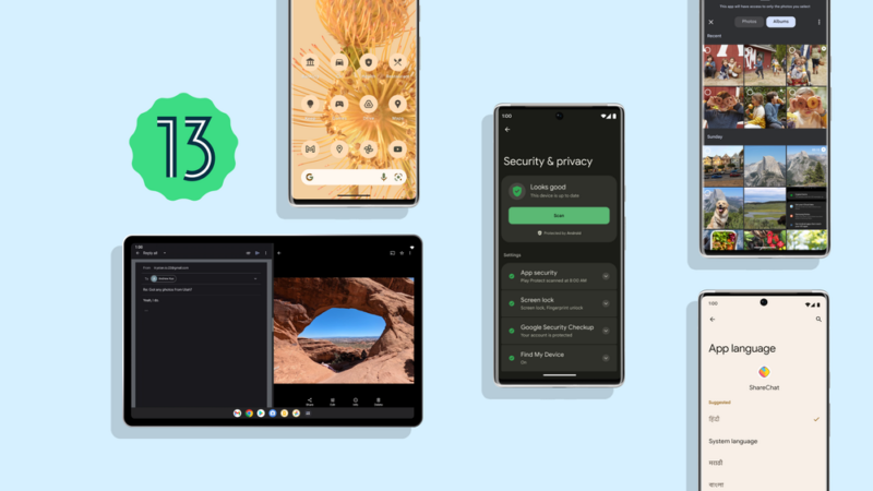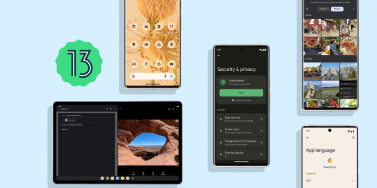
The Android update treadmill continues with the release of Android 13. It’s one of the smallest Android releases in recent memory, with barely any user-facing features to point to. Keep in mind, though, that this update follows the monster Android 12 release from last year. This is also the second Android OS release this year, the previous one being the tablet-focused Android 12L update that was rushed out the door in March.
We would have a bit more meat to work with if Android 12L was part of this release, but as it is, we’re left with a grab bag of features for Android 13. It includes many foundational features for Android tablets and smart displays, but there’s not much here for phones.
Even so, there are things to discuss, so let’s dive in.
The notification panel

Ron Amadeo
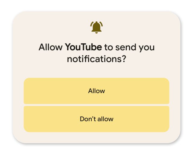
One of the nicest changes to Android 13 is the addition of the runtime notification permission. You’ve been able to block apps from showing notifications for years, but apps now need to explicitly ask for permission to beep at you and will pop up an “allow/deny” box at startup. As someone who rarely wants to be bothered by my phone, I’ve found my approval rate is very low. It feels like 95 percent of apps ask for notification permissions, and I approve maybe 10 percent of them. It’s very satisfying to preemptively swat down annoying notifications.
As far as I can tell, this permission pop-up only appears if you start from a fresh install. For upgraders, everything already has notification permissions, and the OS won’t ask.
Google actually made a task manager
-
After all those Android task-killer apps, Google finally built a version into the OS.
Another new notification feature is Google’s “Foreground Services (FGS) Task Manager,” which is a user-facing task manager that sits at the bottom of the quick settings panel. Google and Apple try very hard to not let consumers have as much control over smartphones as they do PCs, but Google has finally given users a list of running apps they can kill. It’s not a list of every app like a traditional task manager; it’s just a list of foreground services. Foreground services are Android apps that are currently doing active work, even if they aren’t showing an interface to the user—things like a music player, fitness tracking, automation, or a sync service.
The task manager lives at the bottom of the quick settings panel as a long, circular bar that reads, “X apps are active.” Tapping on it will show a list of running apps, with a “stop” button next to each one. This isn’t Android’s first task manager—there have been various running-app interfaces available in the developer settings over the years—but it’s the first one meant for consumers.
In Android 8.0, Google brought the hammer down on background processing, saying that if apps didn’t want to be automatically shut down by the system, they needed to show the user when they were running. In previous versions of Android, an app would spawn a notification saying it was running. While it’s helpful to know what apps are running, putting this information in the notification panel and showing an eye-catching status bar icon was annoying. The notification panel should be for new and temporary items, not a 24/7 reminder saying, “Tasker is running.”
In Android 13, the task manager takes over the notification duties, and now the permanent notification is no longer required. The notification will still pop up, but it can now be dismissed, unlike in previous versions of Android. Swipe away the notification, and the only indication that an item is running will be in a neatly minimized number at the bottom of the quick settings panel. This is a much nicer way to handle running-app notifications.


