Apple managed to stuff at least one more release into an already jam-packed October. A beta redesign of the web-based interface for iCloud makes it more customizable and visually appealing. It’s worth bookmarking, especially if you occasionally use a mix of Apple-made devices and other computers.
The big difference is customization. The current iCloud web portal, when logged in, presents you with a grid of large buttons, which you can’t move or change. It’s a mild irritation if you don’t use some of those services, or want to quickly create a new note, calendar appointment, or other item without having to head into the app. The beta, accessible at beta.icloud.com (or through a link on the current iCloud site), lets you choose which iCloud items deserve their own widgets, how they’re arranged, and gives you a “+” button to quickly create new items, both in the widgets and in the upper-right corner.
-
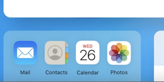
iCloud’s web portal, as it exists for most people, today, with a nudge to check out the beta redesign.
-
How iCloud looks in its beta, with movable, customizable widgets, and easier access to creating new items.
Apple hasn’t abandoned its rigidity entirely, of course. Widgets can be two-column width when viewed in a wider browser, but only one per row, in alternating left/right alignment down the page. Most people aren’t going to use iCloud’s web interface as a primary interface, but it can be convenient for accessing your data when you’re on non-Apple machines, or not signed in. The apps have the same interfaces and capabilities as before.
There’s no indication when the beta might become the default view, so if you use iCloud on the web more often than “when I remember it exists,” it’s likely worth bookmarking the more helpful version.