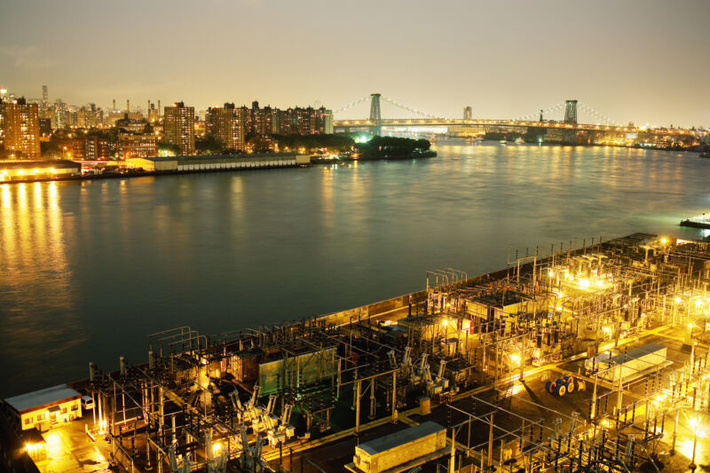
In the US, it’s well-documented that poor neighborhoods are likely to suffer from higher pollution levels. Sources of pollution, like power plants and freeways, are more likely to be located in poor neighborhoods. The ensuing pollution adds to the economic burdens faced by these neighborhoods, with increased medical costs, productivity lost due to illness, and premature deaths.
Since minorities and immigrants tend to live in lower-income neighborhoods, this also adds to the racial disparities present in the US. Now, a group of public health researchers has found another factor that contributed to this disparity. The historic practice of “redlining,” or assigning high-risk scores to mortgages in minority neighborhoods, is also associated with higher power plant emissions, reinforcing the challenges minorities face in the US.
In the red
The term redlining is derived from a federal program, started in the New Deal, that was intended to expand access to mortgages and boost home ownership in the US. The organization that oversaw the program, the Home Owners’ Loan Corporation, set standards for loans that focused on four categories of risk scores, evaluated by neighborhood. The highest risk category was identified on maps with a red line, leading to its name. It was much harder to obtain mortgages in these neighborhoods, which depressed housing prices for their residents.
It’s been widely documented that these ratings were influenced by racist attitudes toward the neighborhood’s occupants. Nearly all the top-rated neighborhoods were entirely white, and neighborhoods with high numbers of minorities and immigrants were frequently assigned the lowest rating. Redlining ended up reinforcing racial disparities in the US and has kept minorities from building wealth through home ownership, with effects that still persist.
The new work expands on that by associating redlining with higher pollution exposure due to power plants.
The work involved looking into everything from historic maps of redlined neighborhoods, the site of power plants (including those that have been closed for decades), and weather patterns to determine the prevalent direction of travel for pollutants from all these plants. Geographic information on exposure to pollution from power plant emissions was also included in the analysis.
The researchers also broke down the analysis into several distinct time periods. These include the post-war period (1940-1969), the post-Clean-Air-Act period (1970-1999), and recent years (2000-2020). Pollution data is only available for the last of these.
The basic measurement the researchers used was whether there were one or more power plants located upwind of the neighborhood and within five kilometers. These measurements were then broken down according to the neighborhood’s rating, which was based on four categories (A to D, with A being the lowest risk category). Neighboring categories were then compared—meaning A with B, B with C, and C with D, to see how changes in risk ratings correlate with exposure to power plant emissions. Changes in these exposures over time were also tracked.
Steady exposure
The analysis found that things were worst in the post-war period when there was extensive growth in power plants and the redlining system in full swing. Here, redlining was associated with a 72 percent higher risk of having a fossil fuel plant nearby. That declined after the passage of the Clean Air Act, but hasn’t changed much in more recent years. Associations were even stronger when the most polluting plants, used to provide peak power, were considered.
In general, this sort of effect was apparent across the different ratings. The top-rated neighborhoods had lower exposure than the next-highest rating, and so on to the C-D differences. And, while the magnitude of these differences varies in the different time periods, the trends are consistent throughout the entire period.
Not surprisingly, this was also associated with pollution exposure. Redlining was associated with an 80 percent increase in exposure to nitrogen oxides, a 40 percent boost in sulfur dioxide exposure, and a 60 percent increase in particular exposure compared to neighborhoods rated just one category higher.
It’s also clear that this difference is persistent. While the magnitude shrunk in the most recent period, the differences in neighborhoods display the same trends—even though the Home Owners’ Loan Corporation shut down in the 1950s. The effect persisted even when controlling for socioeconomic factors.
While racism has clearly played a role in the redlined designations, that doesn’t mean that direct racism played a role in power plant sites. A small difference existed in power plant exposure in the pre-war period that displays the exact same trend that was visible once power plant construction boomed. And there are some indications that the presence of industrial sites like power plants may have influenced the ratings. Finally, low-income communities tend to have less political power and so probably have less input into the placement of power plants.
Nevertheless, the redlining system contributed to keeping minorities in the redlined neighborhoods and thus exposed them to higher pollution levels. So, regardless of the source of the disparity, its persistence is likely to be an outcome of the redlining process. And the impact may be dramatic, as air pollution is estimated to cause up to 100,000 premature deaths in the US.
On the plus side, the US has experienced a dramatic energy transition, shifting its reliance to natural gas, which pollutes less than coal and oil, and clean renewable generation. But the researchers cite evidence that the coal power plants that have been shut down so far are predominantly located near neighborhoods with low minority populations.
Nature Energy, 2022. DOI: 10.1038/s41560-022-01162-y (About DOIs).


